Today I am very pleased to present work of David Picchiottino. And as before this short piece, an introduction to his work, will initiate SnappedAway In Depth Series of this week’s posts: first an interview, then an opportunity to showcase one project and finally a selection of one photo picked from the images published during the whole week, which will be later printed on a t-shirt.
It’s a real pleasure to immerse oneself in David’s work. Suddenly time slows down, and I feel drawn by his contemplative gaze, in a way I am letting him take me on journey within each image. His is a silent, spacious world, this is a space where you can hear yourself breathing and each step reverberates.
Even though his work is always found, not staged, and as he says himself sometimes it’s a split second feeling that makes him take the shot, it all feel very deliberate, suspended in a timeless zone, asking the audience to take it all in detail by detail.
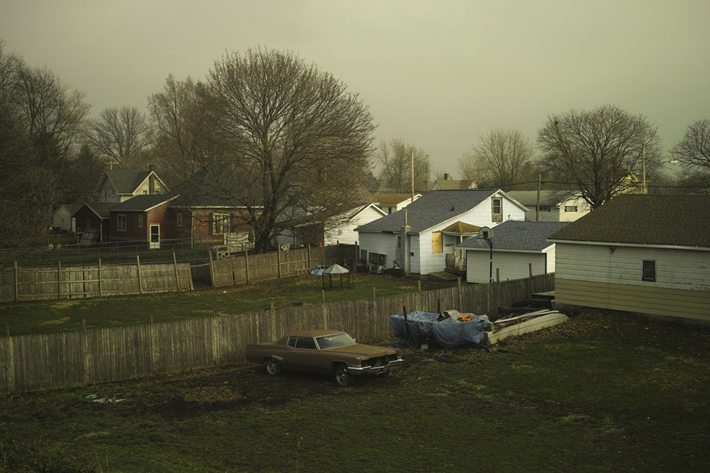
His themes are quite broad, he moves freely between derelict American cities, intimate interior shots bathed in soft light and stuffed animals. What is interesting though, the work does not feel disjointed, even while touching a broad spectrum of subjects. His attention to detail, great colour use and a certain romantic melancholy binds it all together – you definitely feel you’re in a hand of someone who knows what he wants to say and has the mastery over the means of doing it.
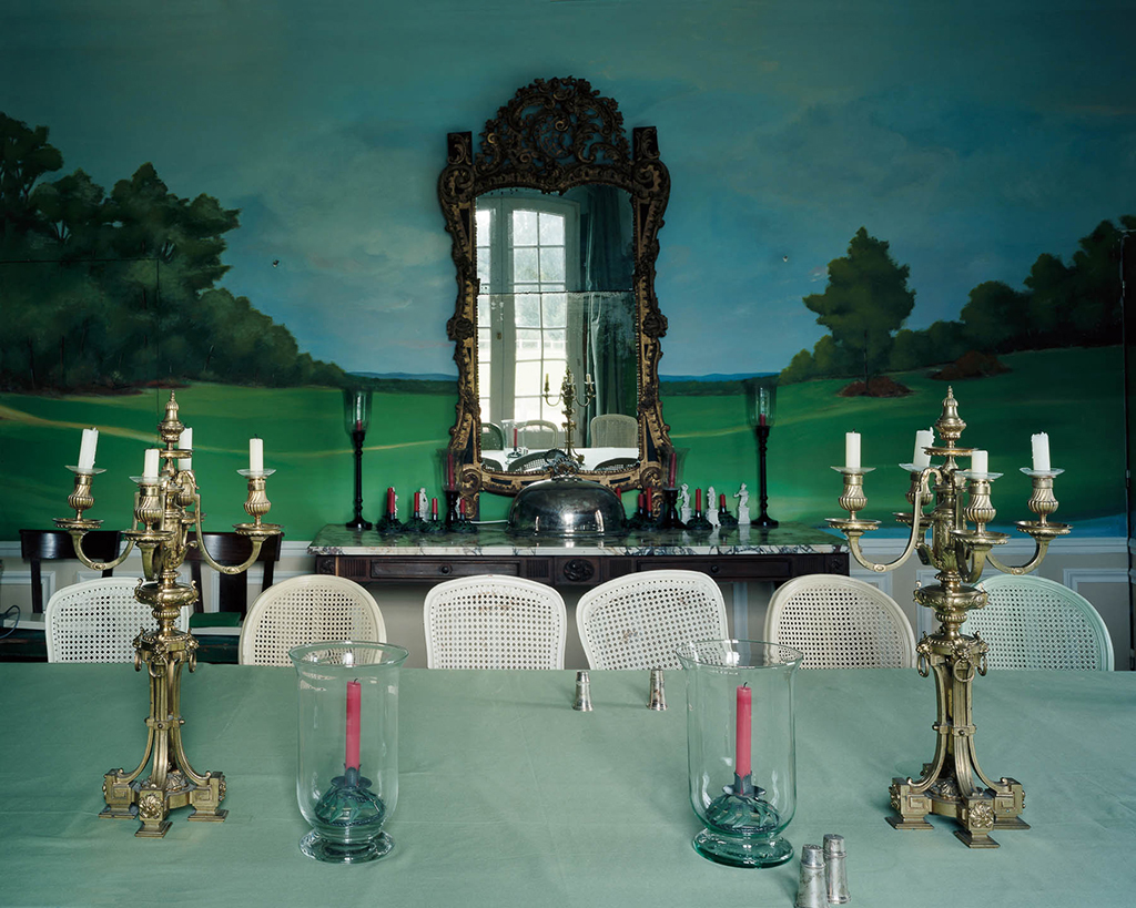
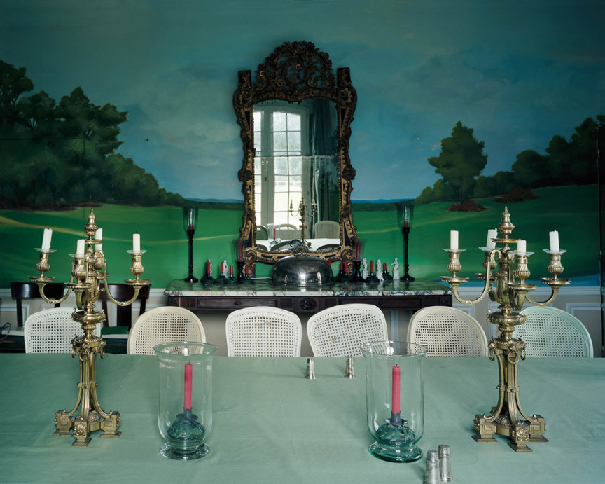
I really enjoy how multi-layered his work is. The above image works in a slow magnetic way, catching you first by the nostalgic grandeur of times go by (who doesn’t like a bit of nostalgia), only to drip more content into your eyes as time flows. It’s not nostalgia by itself we’re dealing with here – that can often be an empty fantasy, a false tale of a paradise of the past that never existed. After you go pass the initial richness of the golden flourishes and shiny objects on display, you start noticing the little, and not so little contradictions in the scene. The pink candles, straight from Tesco, mismatched chairs, the crack and dirt of the mirror, and then the grand finale – the super kitschy landscape on the wall. Suddenly, what was initially a display of wealth and power feels more like a pathetic attempt at creating the illusion of control. The slight asymmetry of the scene, the shift in the mirror’s reflection is a masterstroke, silently bringing in a tone of criticism to the futile attempt of creating an unreal, heavenly environment.
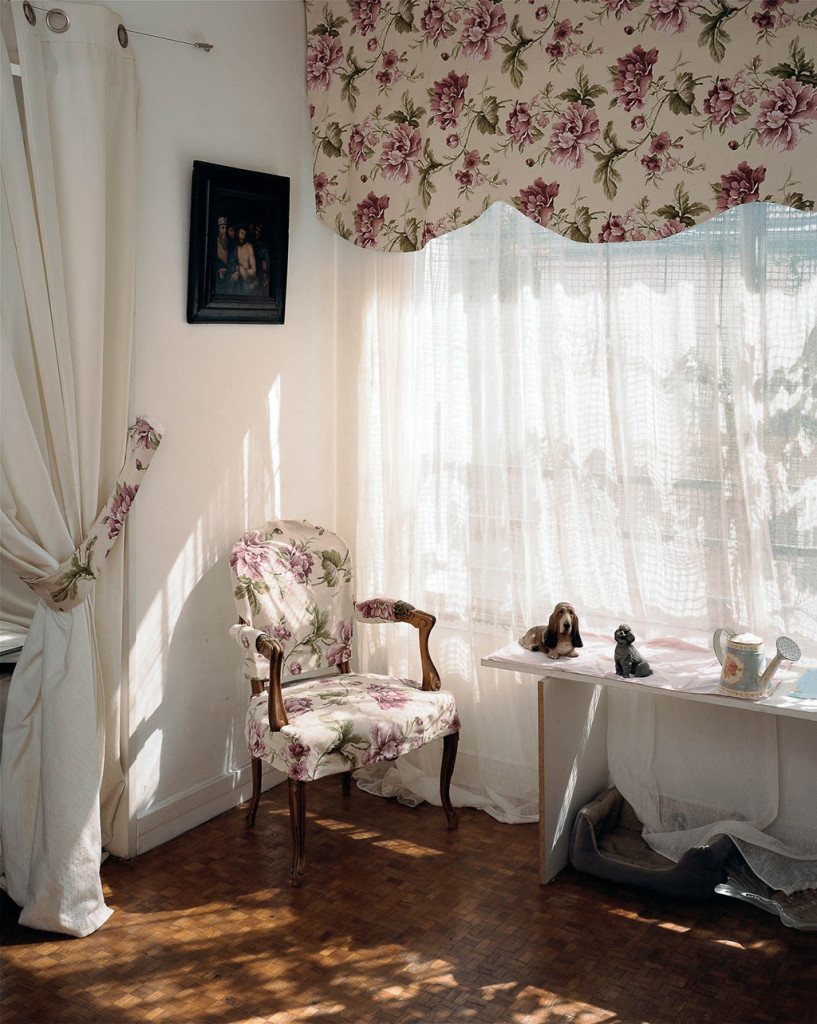
If the first image through it’s dark tones straight away indicated there is something wrong here, this second shot is even gentler and more deceiving. By the skillful use of light one is easily deceived, but worry not, it’s not a lifestyle background for a glossy magazine. Look carefully and again, you are rewarded with details. The first is of course the black hole of the Caravaggio-like painting – this is the “Ecce homo (“behold the man”) – the scene when Pontius Pilate presents a scourged Christ, bound and crowned with thorns, to a hostile crowd shortly before his crucifixion. And of course, this is the title of Nietzsche’s last book, written just before his insanity fully set in, in which he is very critical of himself, the ability of man to develop a meaningful philosophy, and explores the necessary suffering of honest exploration. The cheap dog figurines firmly supported by a makeshift plywood table, that’s another reason the admire David’s work. Did I mention the metal mesh in the window?
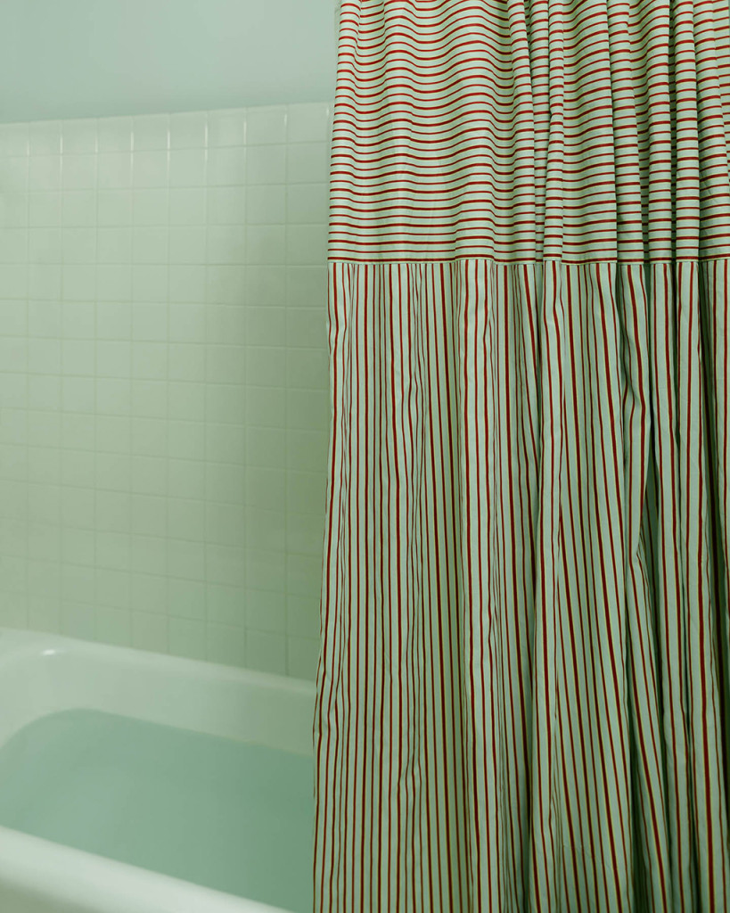
If you’ve been paying attention to the medium’s history, you know Eggleston’s green bathroom photograph. Google it if you don’t. David’s openly states he’s an admirer (so am I if you haven’t noticed), and this image is a tribute to the master, but of course, done in a new way. While the source has often been compared to Holocaust interior, here David goes in a very different direction. The soothing tones, soft light, the gently unnerving pattern of the curtain, all hide the bath full of water – it’s more of an invitation to meditation than a statement, as with the other images.
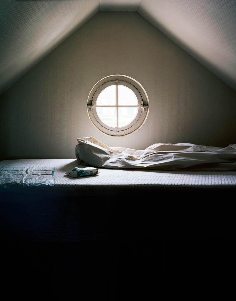
Another window, another mystery shot. Again, beautifully theatrical light, this time a high contrast between the surface of the bed and the impenetrable darkness of the bottom part. To some of you, the items on the bed may remain a mystery – while it is fairly easy to notice the cosmetic wipes, you may wander what is about to happen here (or has just happened). To the slightly older of you out there, you are now probably smiling, as you can tell a nappy changing setup from a distance. But wait, why the drama, the darkness, the silent tension in the crisp light? I think this is one of best depictions of the difficulties of parenting (and the humour only makes it better). The darkness is the future, the unknowable, uncontrollable future of the person you care about the most, your toddler.
I think you’ve read enough of me, I’ll let you enjoy the rest of the images in silence now. I hope you are as excited to see David’s work here as I am, I can’t wait to share the following posts with you. Enjoy the journies.
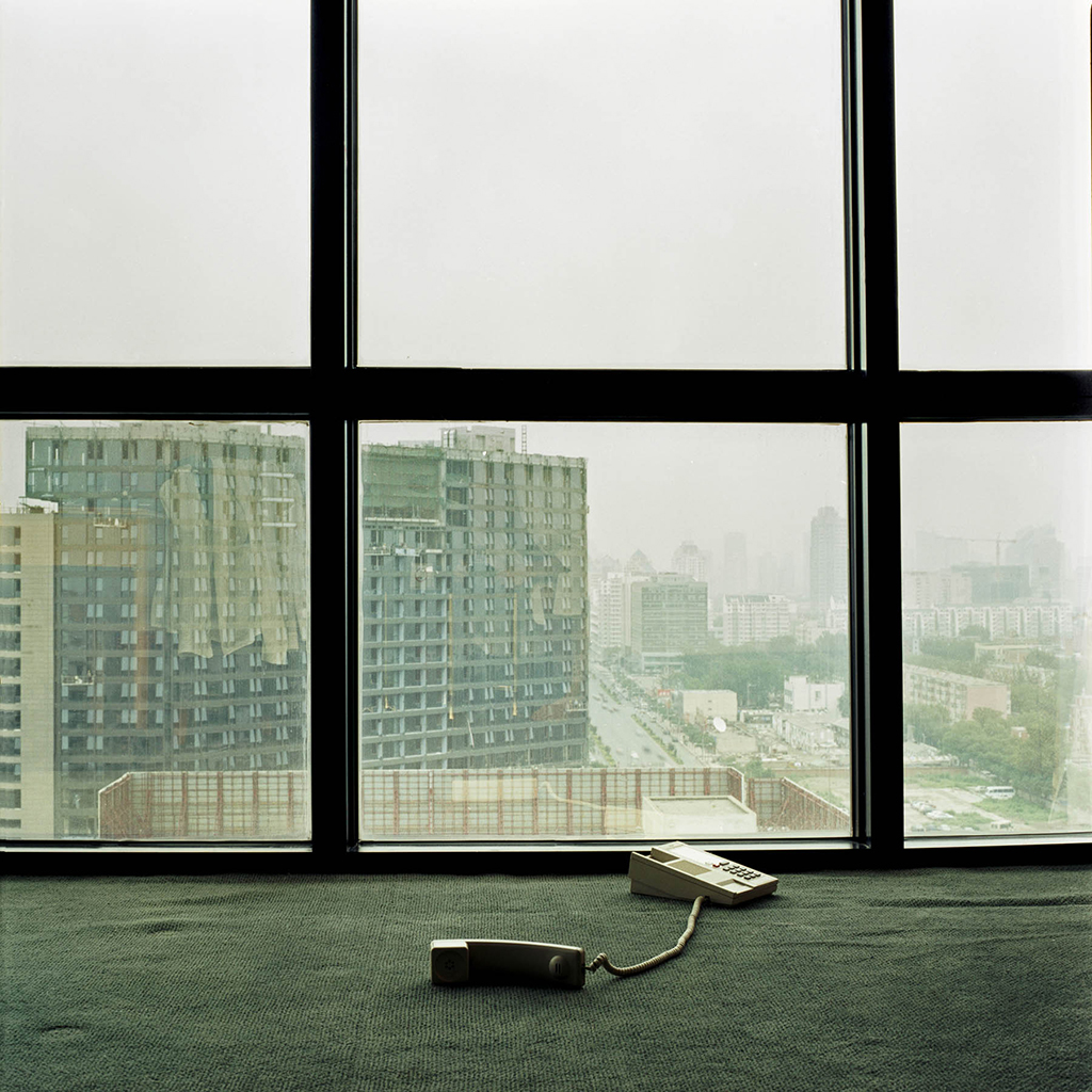
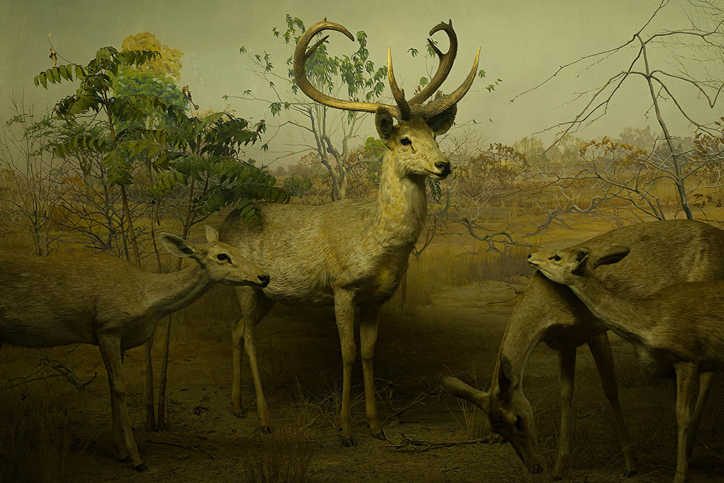
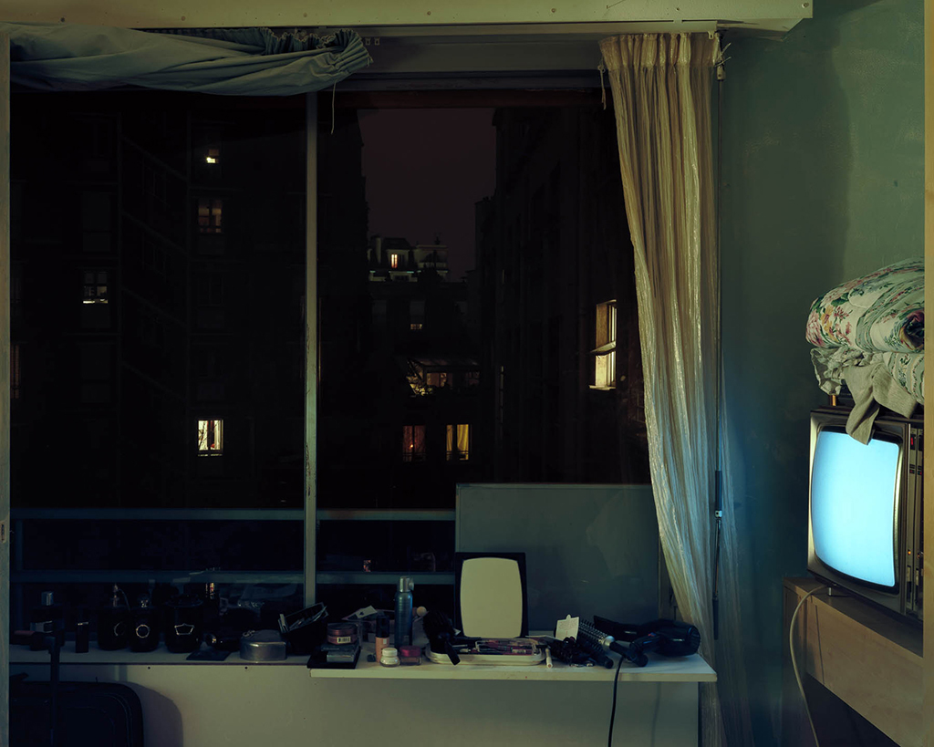
If you enjoyed reading this post stay with us for more of David Picchiottino’s photography. Also you might want to check his website to find out more about his work.
Share this Post
Recent Posts
Introduction to Joseph Podlesnik’s photography
January 30, 2017Photo T-Shirt by Robert Rutöd
December 6, 2016Photo T-Shirt by Valdimar Thorlacius
October 30, 2016

